Triangle
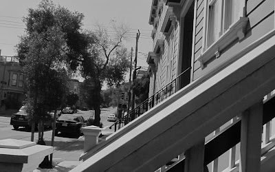
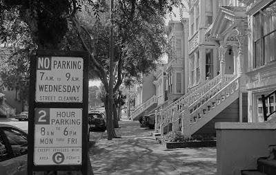
Taking triangular photos requires taking pictures of landscapes or objects in which three distinct subjects, acting as the corners, form a triangular shape. I attempted to take triangular photos by finding objects that formed a triangular shape, or simply finding triangles in architecture.
Diagonal
A diagonal photo is a photo where there is essentially a line made by a subject, which goes diagonally through the photo, typically from one end to the other. I illustrated diagonal lines through hand railings, power lines, and the line separating an apartment building to the sky, shown in the last picture.
Rule of Thirds
A Rule of Thirds photo is one where there is one distinct subject on one side of the photo, horizontally or vertically, and when the photo grid cuts up the sections into thirds, the distinct subject should be exclusively in one of the columns or rows of the photo that is not in the middle. I illustrated the Rule of Thirds horizontally by having the dominant subject be either on the left or right side of the photo.


All of your photos are really good examples of these photo styles. I particularly like your diagonal photos because I think that demonstrate the style in a unique way. As far as I can tell, all the photos you took fit the criteria of the style so I don't have any suggestions.
ReplyDeleteI think you did a really good job meeting the criteria for each photo style. My favorite style you did was the rule of thirds because you took basic items like a street sign and made it as the focus point which I thought was very smart. You did very well overall on this therefor I don't have any ideas on how to improve these.
ReplyDeleteThese photos are really good! I think you showed these three rules of composition very well. I especially like your photos with less exposure; I think it just adds this interesting atmosphere. My only suggestions are that you could revise your use of rule of thirds in the first photo for that section and that you could explore more uses of the triangular rule of composition. It could be a bit more abstract and still have the same effect.
ReplyDeleteI think you did a really good job on this assignment. I love your triangle composition the best because I love how the photos where edited and also taken. I like how you used the top of different houses, I thought that was very creative. I don't have any feed back for you, good job!
ReplyDeleteI think you did a great job. I really like your rule of thirds photos. I think that they have a really clean and simply look to them. I also really like your triangle photos because of the tops of the houses. I thought it was cool and was interesting to see the differences between the three.
ReplyDeleteYour diagonal series is stunning. The way you have placed your images and subjects is very simple, yet sophisticated. I especially like the final photo of the diagonal series because primarily because the sky is so blank, the eye is drawn directly to the lines of the building. On another note, a suggestion for the triangle composition is to find other examples of triangles; maybe examples that are less defined and more abstract.
ReplyDeleteI like all of your photos, my only suggestion is to not use the same concept for photos.
ReplyDeleteGreat job! You did especially well on depicting the rule of thirds theme. However, the fourth photo for your triangle has four images, this might not matter but it's something to think about. Also for your diagonals, it seemed like the third and fourth photos are the same so maybe you could giver a different variety.
ReplyDeleteI really like your rule of thirds composition. The photo of the stop sign looks great!
ReplyDeleteI really like your Rule of Thirds photos. You clearly had a third or two-thirds of the photo with a blocker, leaving the other third or two-thirds with subjects. I really like your first photo because the shadow really helps display the concept of Rule of Thirds. I think for the fourth and fifth Rule of Thirds photo, there is too much going on in the background, which takes away from your main subject, but overall, I think you did a great job!
ReplyDeleteI really like your railings for the diagonal, they are simple yet creative
ReplyDeleteVery clear triangle composition. However, I had trouble Finding the triangle in photo 1.
ReplyDelete