Leading Line
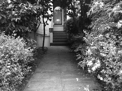
A leading line in a picture is essentially a photograph where there is a shape of a line which moves from the front of the photo to the back. This line helps guide the viewer to the subject in the photo, which is at the end of the line. I took photos of leading lines using sidewalks, pipelines, streets, and architecture.
A leading line in a picture is essentially a photograph where there is a shape of a line which moves from the front of the photo to the back. This line helps guide the viewer to the subject in the photo, which is at the end of the line. I took photos of leading lines using sidewalks, pipelines, streets, and architecture.
Repetition
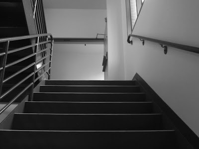
A photo with repetition is one in which there is the same subject being repeated and going in the same direction, making the further subjects smaller than the closer subjects bigger. I illustrated repetition through a fence, stairs, garage doors, and apartment windows.
Depth Staging
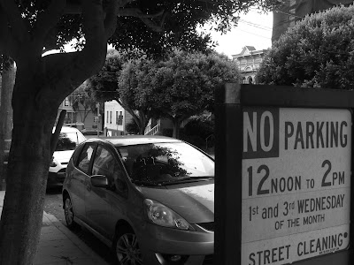
Depth staging is when there are two subjects, one distinctly in the front and one distinctly in the back. Depth staging creates perspective for the viewer. I made examples of depth staging with cars on the street being in the back, and having various subjects in the front.


I really, really like these images. Some of them, like the second one for repetition, could be adjusted slightly in the framing (size and angle). Also, you could produce a wider variety of subjects for depth staging, as many of them are of cars.
ReplyDeleteI agree with Stewart's comment. I really liked the way did leading lines however i think you could have improved the variety of subjects. Overall i think you did really well though.
ReplyDeleteI really liked your leading lines photos because it was very clear where I was looking. I do agree with lauren and I think you could improve the variety of subjects in your leading lines photos. Other than that I think you did very well.
ReplyDeleteI really enjoyed all your photos. They all really capture the element of each composition. I especially enjoyed your leading lines. I do think you could have a different variety of subject however, but overall I think you did a really good job.
ReplyDeleteI like your repetition pictures my only suggestion is to make the subject in the front and the back more clear for depth staging.
ReplyDeleteI think you did a great job of fulfilling the goals of this assignment. My favorite would probably be your repetition photos because of the variety of subjects used. My only suggestion would to adjust the angle of some of your leading line photos so the leading line is more prominent.
ReplyDeleteYour photos are all very interesting! I think with the depth staging you could have blurred the background more to really make the main subject stand out from the stage it is within. Otherwise, your photos are excellent!
ReplyDeleteI like how these are all in black and white. They all seem very related and connected through that
ReplyDelete