Leading Lines
A leading line picture is one in which there is a physical line, not a shape of a line, directed towards an obvious subject. I demonstrated leading lines through hand railings, architecture, signs, and street lines.


 Arrangement
Arrangment photos are pictures where there are big shapes, typically lines, that are so big that they are the subjects of the photo, unlike decorative lines. I illustrated arrangement photos from power lines all the way to wooden fencing.


A leading line picture is one in which there is a physical line, not a shape of a line, directed towards an obvious subject. I demonstrated leading lines through hand railings, architecture, signs, and street lines.


Decorative Lines
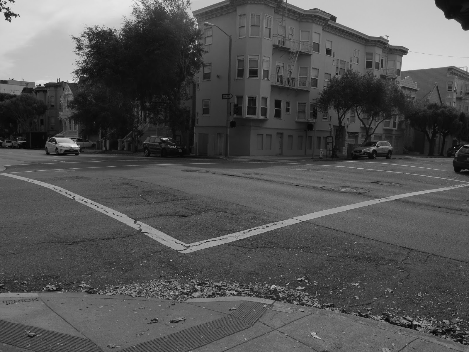
A decorative line picture is one in which there are lines, or designs, that add to the picture, but when they are removed from the photo, they don't alter the image. I illustrated decorative lines from the smallest of lines in the bricks on a stair case, all the way to the crosswalk lines in an entire intersection.


Arrangment photos are pictures where there are big shapes, typically lines, that are so big that they are the subjects of the photo, unlike decorative lines. I illustrated arrangement photos from power lines all the way to wooden fencing.


I really liked all your compositions. I like how simple they are and I like how soft the editing was. I thought that all of your photos went together very well. Good job
ReplyDeletei think each of your sections was really well thought out however I thought your strongest section was your decorative lines section. keep up the great work!
ReplyDeleteThese are all really great! I have no suggestions. I especially like your arrangements of lines.
ReplyDeleteYou did a really nice job on all your photos. They really show your knowledge of the lines. One thing that doesn't really matter is maybe making the photos a little darker to really sharpen your lines.
ReplyDeleteI really liked your decorative line photos. They all showed an different way of using decorative lines. However, I think that you could have found some more interesting ways of showing arrangement of lines.
ReplyDeleteYou did a great job capturing lines that lead to the subject. I particularly enjoyed the first photo because both sides of the walls having leading lines into the subject (door). However, for some photos, like your second and fourth photo the perspective that the picture was taken at, makes it slightly difficult to find the subject. But, these photos were tremendous, especially the arrangement of lines! Amazing job on this composition!!!!
ReplyDeleteAll of your photos are really gorgeous! You perfectly captured all three techniques. My only critique is of your third photo in the leading lines series. I understand that the lines are leading to the lantern, but I also feel like the lantern is cutting off the leading lines and almost interrupting the photo. If you had shifted your perspective to capture the entirety of the lines, this image would have flowed better.
ReplyDelete