Symmetry
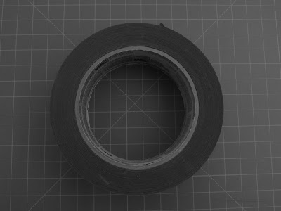
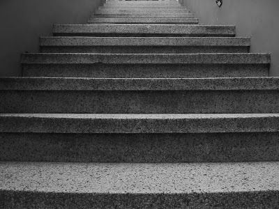
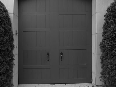
A photo is a symmetrical one if when an imaginary line is drawn down the middle, the left/right can flip over the imaginary line and properly line up with it's right/left counterpart. I illustrated symmetrical photos through symmetrical perspectives in circles, boxes, and lines.
A photo is a symmetrical one if when an imaginary line is drawn down the middle, the left/right can flip over the imaginary line and properly line up with it's right/left counterpart. I illustrated symmetrical photos through symmetrical perspectives in circles, boxes, and lines.
Asymmetry
An asymmetrical photo is a photo in which there are typically two subjects that are not the same size next to each other. I mostly illustrated asymmetry through depth-staging.
Balance
A balanced photo is one in which there are two different subjects next to each other, but the photographical weight to them is the same which makes them balanced. I illustrated this through structures, plants, banners, pipes, and cars.


I think every one of you photos follows the rules for each section which made you post flow very nicely. Since everything follows the rule i don't have any suggestions. Keep up the great work!
ReplyDeleteI think that you did a really great job on all your photos. Each of your photos show that you really understand all the compositions well.
ReplyDeleteYou did a great job on all of your photos. I particularly liked your asymmetry photos because of the different subjects you used. I don't have any suggestions. Nice work!
ReplyDeleteMax: I really, really, really like these images. I especially enjoyed the ones for asymmetry. I have no critiques. Good job!
ReplyDeleteI like your balance photos, my suggestion is to work on your angles.
ReplyDeleteI thought your symmetry composition was the best because of how simple they where. I really liked the editing on all of your photos. I don't have any suggestions for you.
ReplyDeleteI really like the way you edited these photos to show the lightest lights and the darkest darks while still maintaining a soft feel. I have no critiques.
ReplyDeleteMax! These photos are fantastic and show the concept of each photo. I have no suggestions for these photos, as they are great! Fantastic work! You have a great visual eye.
ReplyDeleteEach one of your photos are amazing. Each photo is simply, but portrays the concept. Awesome job.
ReplyDelete