Fall Series 2: Nathan Lyons
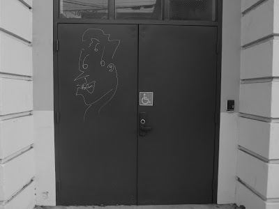
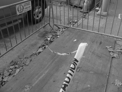
I am basing my project on Nathan Lyons' photos. His visual recipe is: odd subjects out of their natural habitat, dark and urban backgrounds, shadows, and black and white. What make his photos have a general theme of oddness are how most of his subjects he takes pictures are usually out of context and out of place. His photos never featured or showed any "real" person, but could have featured "not real" or "fake" people. A "real" person is a direct picture of a living person, while a "not real" or "fake" person could be a physical copy of an image of someone, or a mannequin. There wasn't really anything "living" in his photos. He did this in order to create an isolated feel to his images, as a photo with no "real" human face makes the viewer feel secluded.
I am basing my project on Nathan Lyons' photos. His visual recipe is: odd subjects out of their natural habitat, dark and urban backgrounds, shadows, and black and white. What make his photos have a general theme of oddness are how most of his subjects he takes pictures are usually out of context and out of place. His photos never featured or showed any "real" person, but could have featured "not real" or "fake" people. A "real" person is a direct picture of a living person, while a "not real" or "fake" person could be a physical copy of an image of someone, or a mannequin. There wasn't really anything "living" in his photos. He did this in order to create an isolated feel to his images, as a photo with no "real" human face makes the viewer feel secluded.


I like all of your photos, my suggestion is to be careful with reflection of the see-through windows.
ReplyDeleteI think all of your photos are really good but i do agree with anna about the reflections.
ReplyDeleteYou did a great job at following your visual recipe. I think the photos with the graffiti really give off the eerie vibes. I don't have any suggestions. Nice work!
ReplyDeleteI really like your photos, you did a really great job following your visual recipe. I agree with kiki, I like the graffiti photos and the vibe it gives off. I don't have any suggestions for you, good job!
ReplyDeleteMany of these are very good, although some of them I'm not sure really capture the themes of Lyons' work that you talk about. You talk a lot about the "eeriness" and "oddness" of his photos, and some of these do match that very well, but your subjects in some of these I think could be more unique and weird.
ReplyDeleteI like your photos. I think you really followed your recipe well. Good job.
ReplyDeleteI like how mysterious the graffiti photos are, and they all seem to benefit your visual recipe greatly
ReplyDeleteThese photos are so interesting! It's crazy how you made everyday things seem so mysterious and eerie. I especially like your graffiti pictures!
ReplyDeleteI really like the mood that you capture within this series.
ReplyDelete