Draft 2
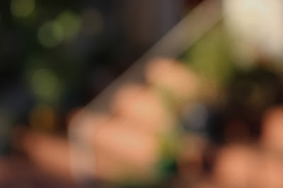
My project is based off of Uta Barth's photos. I did this by fully zooming in and going fully out of focus. By doing this, I was able to create simple shapes with simple colors. I wanted to mix colors and geometric shapes in a way to create a neat abstract image. I added the PicMonkey Film Grain filter to each of my photos in order to make my photos more simplistic. My themes are very simplistic and calming, and they make the viewer really think about the photo and try to interpret what the subject of the photo is. After my first day of taking photos, I learned that street lights are very good subjects for my photos, as they emit an unusual and prominent color. My photos changed since my Draft 1 photos by becoming more colorful and abstract.
My project is based off of Uta Barth's photos. I did this by fully zooming in and going fully out of focus. By doing this, I was able to create simple shapes with simple colors. I wanted to mix colors and geometric shapes in a way to create a neat abstract image. I added the PicMonkey Film Grain filter to each of my photos in order to make my photos more simplistic. My themes are very simplistic and calming, and they make the viewer really think about the photo and try to interpret what the subject of the photo is. After my first day of taking photos, I learned that street lights are very good subjects for my photos, as they emit an unusual and prominent color. My photos changed since my Draft 1 photos by becoming more colorful and abstract.


I really like the blurred photos because you can still kind of make out what the photo is portraying. I really like the color peeking through. It is also cool how there are reflections from the cars. Great job this week!
ReplyDeleteThese photos are so cool. It takes a lot of observing to see what the photo is and I think that's a very unique thing. Keep up the great work!
ReplyDeleteInteresting. I think you could go a little bit less overboard with the film grain, but other than that, keep experimenting with this. I'd say you could get some more vivid colors involved so the photo has a less dull vibe.
ReplyDeleteThese are really blurred! Maybe go a little lighter on the blurring, but I really like the spots of color, it addes a nice touch to the blurriness. Keep on blurring
ReplyDeleteLike I commented before, I really think you should try taking pictures at night to get the blurred lights of a cityscape. Otherwise, I really like your pictures and the vibrant colors. Additionally, maybe consider adding people in to the frame.
ReplyDeleteThese are very good Max. I still like the images that have more light to them, but the ones with trees are also very good. I wonder if you could blur over people??
ReplyDeleteI think your photos are really good. I think they have this very different vibe to them. You did a good job.
ReplyDeleteGood job Max! I think you met your goal of simple shapes and simple colors. I think your best images are the ones with geometric shapes that stand out within the photo. Also, the abstract images of light within your pictures make the image more interesting. Good work!
ReplyDeleteI suggest more flashes and popping lights
ReplyDeleteVery simple subject yet tells such a complex story. A job well done. Good job of adding things like grain to your photos to make them POP.
ReplyDelete