Class Project 1

Class Project 1
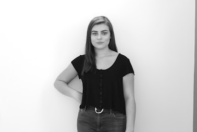
I tried to recreate Lauren's fall series by taking black and white pictures of Lauren while she was using her arms to make shapes.

I tried to recreate Daro's miniature world by making Daro seem short by having him sit under a table.

 I tried to recreate Lakpa's photos by overlapping and fading her face with a scenic picture. I feel like this photo is really relaxing.

 I tried to recreate Liam's photos by overlapping and fading his face with a scenic picture.

I tried to recreate Armon's photos by taking a picture of him with abstract architecture behind him.

I tried to recreate Stewart's photos by taking a picture of him sitting in an urban area. I also tried to make the picture look like Stewart wasn't aware of his photo being taken.

I tried to recreate Danny's athlete series by taking a portrait of him.

I tried to recreate Ava's ghost series by taking a picture of her, printing it out, and then painting over her body with white paint to make it look like she's a ghost.
Comments

  1. I think you did a great job recreating the photos of everyones series. Nice job

    ReplyDelete
  2. I really like your photos especially the visual key you used for Daro.

    ReplyDelete
  3. This comment has been removed by the author.

    ReplyDelete
    Replies
    1. Great Job Max. I like your impression of Daro's because you put a twist on his style which was super interesting, Fantastic Work!

      Delete
  4. You did a nice job replicating each series. I like how you put stewarts photo in black and white, it's a nice twist on his series

    ReplyDelete
  5. I think you did a great job of replicating everyone's styles. Keep it up!

    ReplyDelete
  6. These are great! I think the overlay was the strongest section. Good job mac

    ReplyDelete
  7. Great job Max! My only suggestion is to spend some more time on the cropping of the overlay photos, like Lakpa and Liam's.

    ReplyDelete
  8. Great job this week. I don't have an suggestions for you.

    ReplyDelete
  9. i really like how creative you were with Daro's series, it made him look much smaller compared to the rest in the shot

    ReplyDelete

Post a Comment

Popular posts from this blog

Spring Project 3

Spring Project 3 I went all out for this series. I had taken many photos over the past weeks, and I was able to edit all of them this week. I'm really proud of how this week turned out because I created a sense of flow in each image, despite having a wider range of subjects in the series. I used more natural lighting this time too, and I avoided creating silhouettes. One of the problems with this specific post is that the dimensions of each image are not consistent. This has been a very fun but tedious project to work with. 

Fall Series 3

Fall Series 3: Nathan Lyons I am basing my project on Nathan Lyons' photos. His visual recipe is: odd subjects out of their natural habitat, dark and urban backgrounds, shadows, and black and white. What make his photos have a general theme of oddness are how most of his subjects he takes pictures are usually out of context and out of place. His photos never featured or showed any "real" person, but could have featured "not real" or "fake" people. A "real" person is a direct picture of a living person, while a "not real" or "fake" person could be a physical copy of an image of someone, or a mannequin. There wasn't really anything "living" in his photos. He did this in order to create an isolated feel to his images, as a photo with no "real" human face makes the viewer feel secluded.

Composition 2- Leading Line, Repetition, and Depth Staging

Leading Line A leading line in a picture is essentially a photograph where there is a shape of a line which moves from the front of the photo to the back. This line helps guide the viewer to the subject in the photo, which is at the end of the line. I took photos of leading lines using sidewalks, pipelines, streets, and architecture. Repetition A photo with repetition is one in which there is the same subject being repeated and going in the same direction, making the further subjects smaller than the closer subjects bigger. I illustrated repetition through a fence, stairs, garage doors, and apartment windows. Depth Staging Depth staging is when there are two subjects, one distinctly in the front and one distinctly in the back. Depth staging creates perspective for the viewer. I made examples of depth staging with cars on the street being in the back, and having various subjects in the front.