Class Project 2

Class Project 2

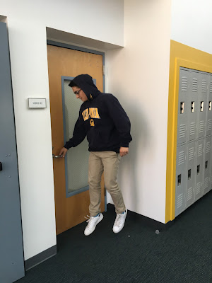
I tried to recreate Kiki's levitation series by taking a picture of Kiki while she is levitating and doing an ordinary task, like opening a locker.

I tried to recreate Casey's series by taking a picture of her in front of a scenery.

I tried to recreate Sophie's series by taking a long exposure picture of her walking and then putting it into black and white. 

I tried to recreate Anna's series by taking a picture of her against a solid color background, putting a comicy filter on it, and then giving Anna a speech bubble to say something.

I tried to recreate David's levitation series by taking a picture of David while he is levitating and doing an ordinary task, like opening a door.

Comments

  1. I think you did a nice job. keep up the great work

    ReplyDelete
  2. Great job showing off each of the different styles of the class.

    ReplyDelete
  3. Great Job Max! The image of Sophie is very good. I like how you can see her entire body while it is still blurred. I also like how cartoon like Anna's image looks. Great Job!

    ReplyDelete
  4. Nice job. I think you really go Sophie's panning series down very well. I think you also followed Ann's artist style very well.

    ReplyDelete
  5. Great job replicating everyones work! Super Creative.

    ReplyDelete

Post a Comment

Popular posts from this blog

Spring Project 3

Spring Project 3 I went all out for this series. I had taken many photos over the past weeks, and I was able to edit all of them this week. I'm really proud of how this week turned out because I created a sense of flow in each image, despite having a wider range of subjects in the series. I used more natural lighting this time too, and I avoided creating silhouettes. One of the problems with this specific post is that the dimensions of each image are not consistent. This has been a very fun but tedious project to work with. 

Fall Series 3

Fall Series 3: Nathan Lyons I am basing my project on Nathan Lyons' photos. His visual recipe is: odd subjects out of their natural habitat, dark and urban backgrounds, shadows, and black and white. What make his photos have a general theme of oddness are how most of his subjects he takes pictures are usually out of context and out of place. His photos never featured or showed any "real" person, but could have featured "not real" or "fake" people. A "real" person is a direct picture of a living person, while a "not real" or "fake" person could be a physical copy of an image of someone, or a mannequin. There wasn't really anything "living" in his photos. He did this in order to create an isolated feel to his images, as a photo with no "real" human face makes the viewer feel secluded.

Composition 2- Leading Line, Repetition, and Depth Staging

Leading Line A leading line in a picture is essentially a photograph where there is a shape of a line which moves from the front of the photo to the back. This line helps guide the viewer to the subject in the photo, which is at the end of the line. I took photos of leading lines using sidewalks, pipelines, streets, and architecture. Repetition A photo with repetition is one in which there is the same subject being repeated and going in the same direction, making the further subjects smaller than the closer subjects bigger. I illustrated repetition through a fence, stairs, garage doors, and apartment windows. Depth Staging Depth staging is when there are two subjects, one distinctly in the front and one distinctly in the back. Depth staging creates perspective for the viewer. I made examples of depth staging with cars on the street being in the back, and having various subjects in the front.