
Design 1

Design 1
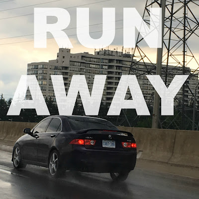
For my images, I tried to make sure that my words were not too far off to the side. I tried to make the words the prominent feature in the image by putting them in the middle. I created two iterations of my work, "Go Go Go." I tried to make each iteration represent some part of the meaning of "Go Go Go." I also tried to make the color prominent in relation to the color of the image in order to make the text easy to distinguish. I also tried to make the font of the text represent what the album or book represents.


Comments

  1. These are very cool and I like how you incorporated outside photos. You made a really good batch!

    ReplyDelete
  2. I really like the variety of color in all of your photos Max. I like the switch between black and colored photos. I feel that the energy in these photos are great. Good Job Max!

    ReplyDelete
  3. I really like the aesthetic of all of your designs. The different colored fonts really make the picture in the background stand out. Nice work.

    ReplyDelete
  4. I really like how you bolded each title. They really stand out and the image really goes well with the titles. I really love the colors in each image, they really bring out the emotion of the covers.

    ReplyDelete
  5. Great work Max! My favorite one is the "Find Some Time" picture. I have no suggestions.

    ReplyDelete
  6. Really cool, great photos and edits.

    ReplyDelete
  7. I really like how your titles are more simplified but they also have lots of different meanings and interpretations

    ReplyDelete

Post a Comment

Popular posts from this blog

Draft 5

Draft 5 My project is based on of Uta Barth's photos. I did this by fully zooming in and going fully out of focus. By doing this, I was able to create simple shapes with simple colors. I wanted to mix colors and geometric shapes in a way to create a neat abstract image. I added the PicMonkey Film Grain filter to each of my photos in order to make my photos more simplistic. My themes are very simplistic and calming, and they make the viewer really think about the photo and try to interpret what the subject of the photo is. After my first day of taking photos, I learned that street lights are very good subjects for my photos, as they emit an unusual and prominent color. My photos changed since my Draft 4 photos by trying to have more simple shapes that have conflicting colors. I continued to try to create shapes in my photos so that the focus is not too drawn out into the corner by some bright light. I also read Casey's comments which suggested me to take these photos at night t...

Draft 4

Draft 4 My project is based off of Uta Barth's photos. I did this by fully zooming in and going fully out of focus. By doing this, I was able to create simple shapes with simple colors. I wanted to mix colors and geometric shapes in a way to create a neat abstract image. I added the PicMonkey Film Grain filter to each of my photos in order to make my photos more simplistic. My themes are very simplistic and calming, and they make the viewer really think about the photo and try to interpret what the subject of the photo is. After my first day of taking photos, I learned that street lights are very good subjects for my photos, as they emit an unusual and prominent color. My photos changed since my Draft 3 photos by having the impact of the grain filter on my photos be less. I tried to create shapes in my photos so that the focus is not too drawn out into the corner by some bright light. I basically tried to create an even balance in all of my photos. ...

Composition 1- Triangle, Diagonal, and Rule of Thirds

Triangle Taking triangular photos requires taking pictures of landscapes or objects in which three distinct subjects, acting as the corners, form a triangular shape. I attempted to take triangular photos by finding objects that formed a triangular shape, or simply finding triangles in architecture. Diagonal A diagonal photo is a photo where there is essentially a line made by a subject, which goes diagonally through the photo, typically from one end to the other. I illustrated diagonal lines through hand railings, power lines, and the line separating an apartment building to the sky, shown in the last picture. Rule of Thirds A Rule of Thirds photo is one where there is one distinct subject on one side of the photo, horizontally or vertically, and when the photo grid cuts up the sections into thirds, the distinct subject should be exclusively in one of the columns or rows of the photo that is not in the middle. I illustrated the Rule of Thirds hor...